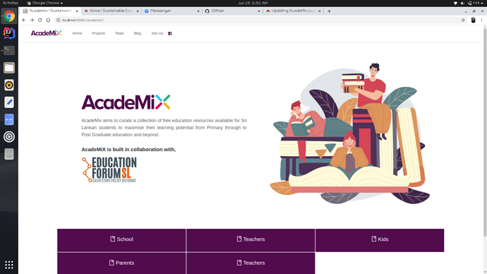
@akshika47 I’ll check on the EFSL logo issue. In today stand-up meeting we’ll discuss about white space issue and about the footer. I’ll give you an full update after 8.30 p.m today. Thank you!
After today’s discussion we came up with some ideas. The EFSL logo issue will be fixed by @Gravewalker & meanwhile he’ll be working on the academix category view. We came up with an idea to display the items. We’ll share it with you’ll in tomorrows meeting. Thank you!
Looking forward to it 
@techTeam how is the AcadeMiX progress? can we launch this tomorrow?
You beat me to it Akshika! Would love to get an update on the launch date 
I’ll check on the launch date. Anyway we need a feedback to develop the academix homepage. How about something like this to display the categories in homepage. Please correct me if there should be any changes! Thank you
Ex:-
Teachers
vector image
Small description (optional)
That is not a priority ATM. We are only focusing on bringing what is on the deepest layer(elements, ex : https://sefglobal.org/academix/sub/7/play-&-learn) to a layer above (sub categories, ex : https://sefglobal.org/academix/3/gce-(o-l) ). Can we first finish that task?
I spoke with the team and @Gravewalker is working on this task. He said he’ll finish it by Saturday. After his PR Academix is pretty much ready to launch. Are there anymore tasks before launch? 
Other one is the footer on the landing page.
I’m working on the header & footer.
Should we include academix logo or sef logo in the header? @akshika47 @Minuri_Adasuriya
Let’s go with the SEF logo.
Do we need the other menus? (projects, team, etc.)
I thought the same and it is not required but to keep the consistency I think it better be there. In other pages like OneLive and ScholarX. It is like that.
Should I include them in the header or not? @akshika47 @jaye 
keep it for the time being.
This is nice.
- Add a simple footer(check the ScholarX page)
- Keep it consistent with the landing page. Hence add the social media icons.
Why have the categories changed again? 
No @Minuri_Adasuriya that’s his local setup. When we develop, we don’t have the original data on our local database. We work with dummy data 
I made the item view as a sub-scene of the SubCategory view.
Here’s the PR for it.


