Sadly. This list does not have anything that I have in mind. Maybe I need GPT-3
So what we need is something compact.
On the left, we can have an image depicting the category. On the right, you would have the text. On the top, you have the option to select Student, Expert etc. Where web site users can press “<” or “>” to change the section.
For example
I am < a student >
< Image > | < Text >
Does this make any sense? I know it sounds pretty vague.
Maybe we can simply show all the options in a vertical list (similar to the current version). But we would have better UI. The current version’s problem is with the beauty of it. It does not match with the other parts of the website.
Looks nice @piumal1999!
Same comment as @DESIRA. Reduce size and maybe capitalize case for the ‘I AM A’ part. Please note that it becomes ‘I am an Expert’ not ‘I am a Expert’
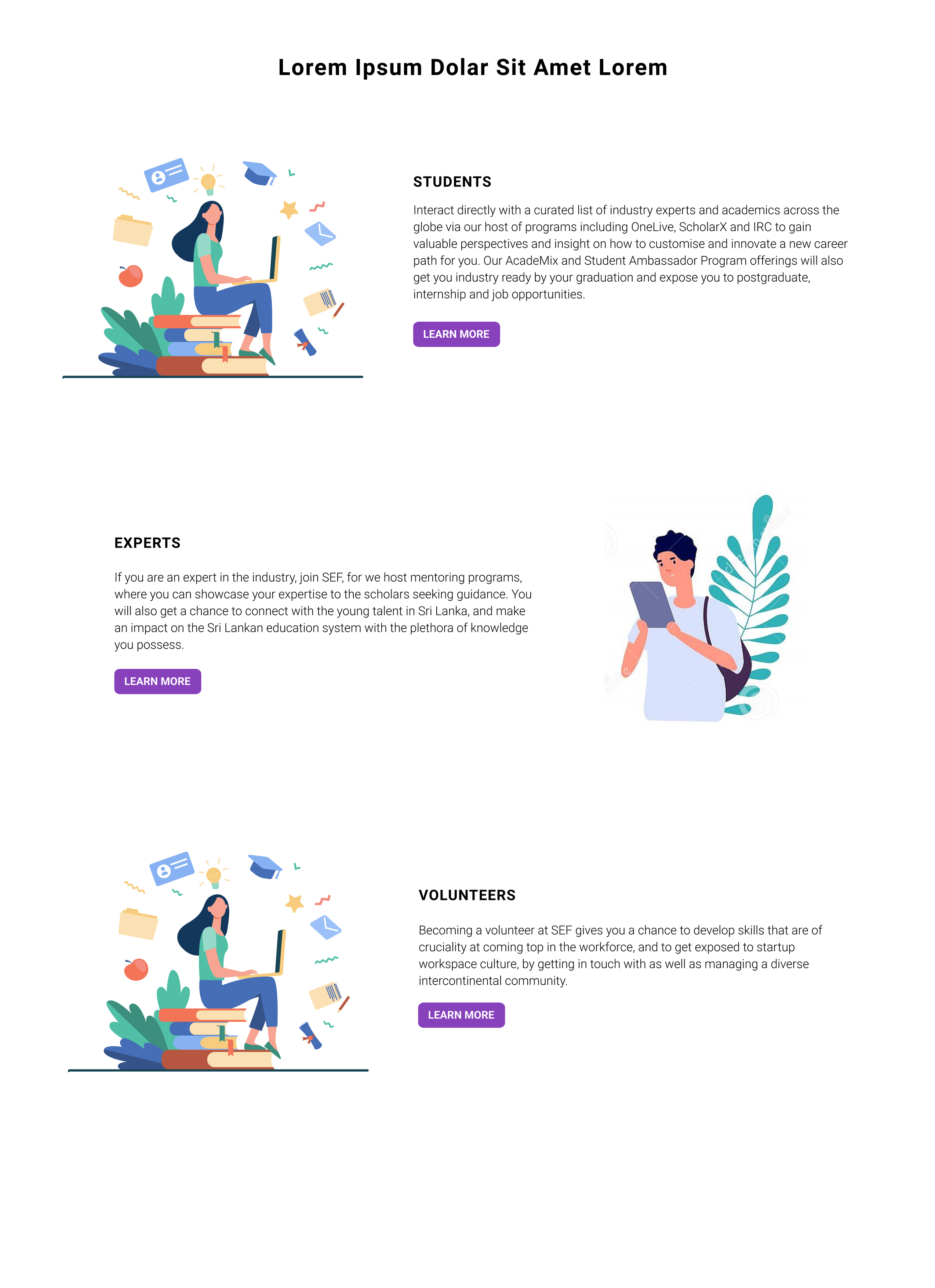
Interact directly with a curated list of industry experts and academics across the globe via our host of programs including OneLive, ScholarX and IRC to gain valuable perspectives and insight on how to customise and innovate a new career path for you. Our AcadeMix and Student Ambassador Program offerings will also get you industry ready by your graduation and expose you to postgraduate, internship and job opportunities.