Hi Guys,
It is looking good thank you for your work!
Here are the two short forms for mentors and mentees to register interest.
Mentee Registration of Interest - Google Forms
Register you interest for ScholarX 2021 - Mentor - Google Forms
Hi Guys,
It is looking good thank you for your work!
Here are the two short forms for mentors and mentees to register interest.
Mentee Registration of Interest - Google Forms
Register you interest for ScholarX 2021 - Mentor - Google Forms
Hi,
I added the PR by updating the ScholarX-21 Page.
Nicely done! Thank you very much, @NaviRocker!! 
@NaviRocker good job! Can you send another PR with these small changes?
Change the wording “mentee” to “student” in the button as I feel that is less confusing.
Bring back the “Register your interest for ScholarX 2021” section to the top and place it just below the hero image as that is the most important section and it needs to quickly accessed. Rest is secondary in importance.
Suggestion/Question: Do you think it is better to replace the hero image with an actual image? like the image of the SX19 graduation photo? cc: @jaye
After that let’s merge it and make this the latest version of ScholarX (linking this to the drop down list)
Fixed it @akshika47 @jaye
Hi guys,
@jaye @akshika47 @NaviRocker @Dharana_J
The ScholarX-2021 is still in the “scholarx-2021” branch. The current work can be viewed from the following link.
https://pr-820-sef-site.surge.sh/scholarx/2021/
Are there anymore changes to be done? Also, @Dharana_J will you please be able to check the 2 forms which are there for mentees and for students and check if there are any more changes which need to be done?
I would like to have some space between the first two sections. @Dharana_J please let us know what you need on the landing page. Especially things that would help you in reaching out to mentors.
Hi @akshika47,
I added more space between the two sections.
Thank you. @piumal1999 @Janeth_Fernando how is the website standard document coming along. For example, on this page, there needs to be colour alteration between section to separate them.
Hello!
It looks great - Only possible addition to the registration page I can think of is maybe an email address (or anything else) for support/report and issue type of thing.
Edit: Also what do you think of the idea of a share button? so people can share on their social media the link to the form?
Hi @Dharana_J
As you suggested I added social media share buttons to share both the form on Facebook, Linkedin, and Twitter. You can view the work from the following link.
Thanks, @Janeth_Fernando it works like a charm!
Btw, I think we discussed on the last standup (5th Sep) was to share the page (the ScholarX page link) but not the form. The share buttons should be on the scholarX page. (The reason we came to that conclusion was, the user might get confused if we directly share the form. If we could share the page itself, then the users can get an idea about the program and apply as a mentee or a mentor as they wish)
Another suggestion that came out from the general meeting was to add it to both header and the bottom of the page (as a call to action). Apologize for being late to inform you.
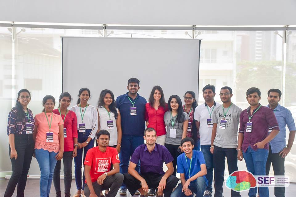
This one also discussed at the meeting and requested to add the photo from Vladimir’s session. (or we can add one from scholarx 2019) The point was to provide a social proof.
Here’s the image:
@Janeth_Fernando you can get help from @miluckshan-j too.
How about having something like this instead of directly replacing the image?
Just my 2 cents, though!
Hello, I like to work on adding this photo to the scholarx page.
I changed the findmentor image to the photo provided by @jaye, do you guys have any suggestions to improve this?
Screenshot
Or as an alternative method, we can align content like this, just suggestion, what do you guys think?
Thanks for getting this done @Dilshan_Naveen! @Janeth_Fernando @akshika47 @Dharana_J Do you have any idea?
Hi @Dilshan_Naveen!
Thank you for contributing to this. In my opinion, the 1st screenshot(content on left and image on right) looks okay. Because it would be consistent. In the home page also we follow the exact format where the content is on the left and the illustration is on the right. If it is possible, make the image bigger, so it will be more visible.
I agree with @Janeth_Fernando, until finalise and change all the pages together, we should stick to the existing standard.


